
Resources » Working With PDFs »
Today, it’s just as common for someone to view your PDF on a phone as on a computer. If you have a smartphone, try it yourself. Download a PDF and open it to see what it looks like. Both iPhone and Android devices have built-in or downloadable PDF readers. Is all the text easy to read? How much do you have to zoom? How long does the document take to load?
It’s never been more important to make your PDFs mobile-friendly if you want to share your PDF with as many people as possible. But what does it mean for a PDF to be mobile-friendly?
In this guide, we’ll be walking through some of the best ways to optimize a PDF for mobile.
What Is A Mobile-Friendly PDF?
A mobile-friendly PDF is a document that’s created with smartphones in mind. There’s nothing technical you have to do with your PDF. Users will be able to download, open, and view PDFs on any smartphone. However, there are a few things about smartphones that can make certain PDFs difficult to read or access.
For example:
- Older mobile devices often have a lower screen resolution than most laptops or computer monitors.
- Smartphones usually don’t have as much storage capacity as a computer.
- Text on mobile devices can be difficult to read due to smaller screen size.
- Most smartphone users download documents using their mobile data, which typically has more limits than WiFi.
With these factors in mind, you might begin to see how a PDF can potentially be difficult to read for a smartphone user. If it has a lot of high-resolution pictures and dense blocks of text, it will be very difficult for someone to read it on their smartphone.
Another factor to consider when you are creating and publishing PDFs is that Google and other search engines prefer content that is mobile-friendly, including PDFs. Google can index and rank PDFs, but mobile friendliness plays a role in how well PDFs perform in search. Because Google uses mobile-first indexing, a PDF that’s too large, hard to read, or poorly formatted on a smartphone may lead to higher bounce rates and lower visibility in search results. Optimizing PDFs for mobile, by keeping file sizes small, text readable, and layouts clean, improves both user experience and SEO.
How To Make a PDF Mobile-Friendly
To start out, let’s edit the PDF while it’s still a document so that it works better with mobile devices. The reason we want to do it at this point is that this is when the document is easiest to change and edit. Once you export a document as a PDF, you can think of it as “locked in” — it will require a specific software or app to edit it.
There are two great tools that you can use to edit a document into a mobile-friendly PDF:
- A native document editor like Microsoft Word* or Google Docs
- A PDF editor like PDF.Live
Open your document in the editor of your choice. To make it mobile-friendly:
- Increase the size of the font so it’s viewable on a smartphone.
- Add headings and bold or italic text for specific points you want to highlight. You can also try replacing large blocks of text with bullet points (for ease of reading).
- Use a single column for your text so the user doesn’t have to swipe left and right on their phone screen.
- Make the margins of your document smaller, so the user doesn’t have to scroll up and down as much as they read.
- Reduce the size and number of your images, and compress them so the file size stays small. Every image will increase the size of the document.
Mobile-friendly PDF example
As an example, here’s a document that would be poorly formatted for mobile devices:
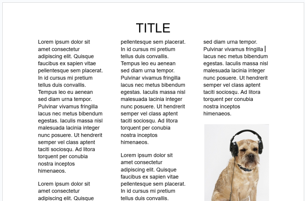
The text is very small and in multiple columns. The margins are wide, which leaves a lot of unused space on the document. There is a large, high-resolution image taking up space in the middle of the document. If you downloaded this document on your phone, you’d be constantly scrolling up, down, left, and right as you read.
Below, we’ve created a document that’s been optimized for mobile:
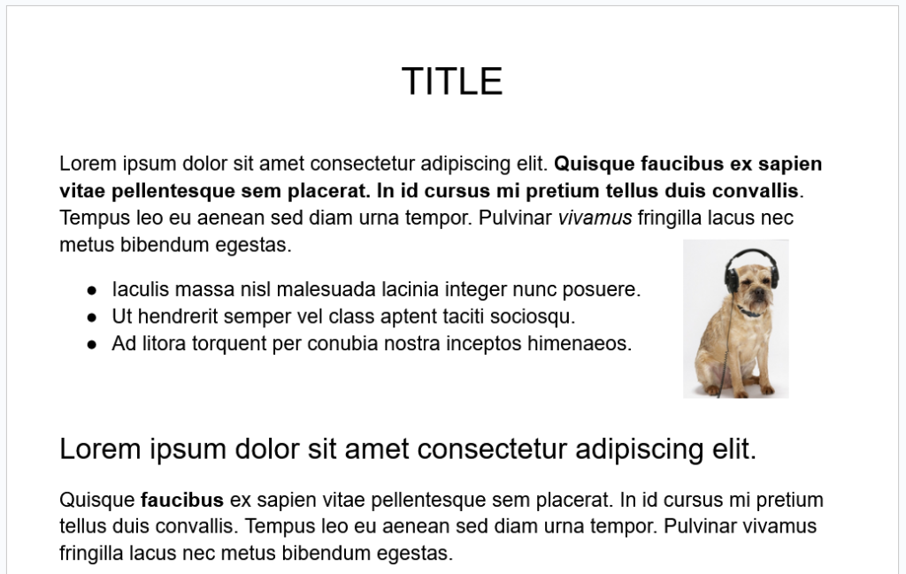
This document has an increased font size, key sentences bolded and italicized, headings, a bullet point list, and a much smaller image that’s aligned with the text. Remember that you can also increase the font size of your headings.
We’ve also taken the time to break up the larger paragraphs into smaller sections so that the reader doesn’t get lost in a large block of text.
Note that this change makes it more mobile-friendly, as well as much nicer to read on desktop screens too.
Does File Size Matter in Mobile-Friendliness?
Once you’ve changed the formatting settings of your PDF, you may still have a large file size. This is because even resized images will often have high resolution. As a result, your PDF may take extra time to download and open on a mobile device. So how can you fix this?
To reduce large file sizes in PDFs, take advantage of a PDF compressor. Learn more about how PDF compressors work here.
As for the images in your PDFs, we recommend using lower-resolution versions of the images. You can use an image compressor, which will similarly convert your image to a lower-resolution version. If you’ve resized your image to be smaller in your document, the decrease in quality won’t be noticeable.
If your PDF is still large, you could consider breaking it up into multiple PDFs. Depending on the use case of your document, you may want to do this anyway if you want specific key sections to be searchable or downloaded separately on smartphones.
Are PDFs Responsive?
Traditional PDFs are not responsive like websites. A PDF preserves its exact layout, which means it won’t automatically adjust to different screen sizes. That’s why reading a standard PDF on a phone often requires zooming and scrolling.
However, there are ways to make PDFs behave more responsively:
- Tagged or accessible PDFs: When properly tagged, text can reflow, making it easier to read on smaller screens.
- Alternative formats: To create a responsive PDF, convert it to an EPUB or HTML, which can be a truly responsive reading experience.
While PDFs aren’t naturally responsive, optimizing them for mobile (with tagging, compression, and clean formatting) ensures they’re much more user-friendly on smartphones.
*Microsoft Word can output an ISO 19005-1 compliant/PDF/A that supports the PDF reflow mode spec so a PDF viewer like Adobe Reader can optimize how it displays content for mobile (and assistive reading devices which is what the reflow mode spec was originally intended for). The Word doc needs to utilize tags to denote headers, paragraphs, tables, form fields, alt text, etc.